The Duck Curve
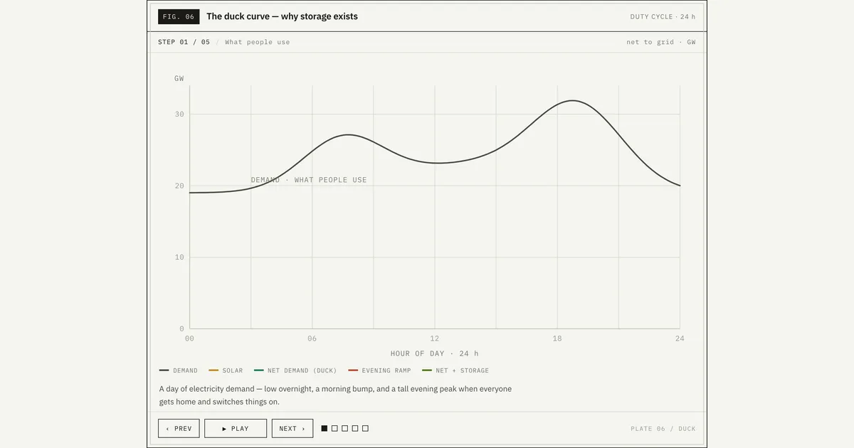
Why storage exists, in five steps: daily demand, growing midday solar, the net-demand "duck", the steep evening ramp, and a battery that charges on the midday surplus and discharges into the evening peak to flatten it.
Download the Duck Curve diagram
Free to download and reuse — including commercially — under CC BY 4.0, with credit to BESS.engineer. Licence & attribution →
Browse all BESS diagrams →
What it shows
The duck curve is the shape of net demand — total electricity demand minus solar generation — across 24 hours, plotted here in GW. In five animated steps the figure builds a demand curve, grows midday solar year over year (2018 to 2030), subtracts it to reveal the duck's BELLY, NECK and HEAD, marks the steep evening ramp, then adds a battery that charges on the midday surplus and discharges into the evening peak.
Why it matters for BESS
Net demand is what dispatchable plant and storage must actually serve; solar flattens the daytime middle but does nothing for the tall evening peak after sunset. As midday solar grows, the belly sinks and the neck steepens, so the grid must ramp up harder and faster each evening — nearly twice (about 1.75x) as steeply as in 2018. That ramp, not the low belly, is the problem a battery is bought to solve: it is the clearest single-picture argument for why storage exists.
How to read it
The x-axis is hour of day (00–24), the y-axis is net-to-grid power in GW. Grey is raw demand, amber is solar, and the teal line is net demand — the duck. Watch step 4: the red segment climbs from the midday BELLY to the evening HEAD, labelled with its ramp rate in GW/h. In step 5 the blue CHARGE band fills the belly and the red DISCHARGE band shaves the peak, leaving the flatter green NET + STORAGE line; the STORAGE tank tracks state of charge from 12%.
Frequently asked
- What is the duck curve?
- The duck curve is the daily profile of net demand — electricity demand minus solar generation — whose silhouette resembles a duck. Growing midday solar pushes the middle of the day down (the belly), while the evening peak after sunset stays tall (the head), with a steep neck connecting them. It is the standard way grid operators visualise how solar reshapes the load a dispatchable fleet must serve.
- Why is the evening ramp a problem and not the low midday demand?
- The problem is the rate of change, not the depth. As the sun sets while demand climbs toward its evening peak, net demand rises very fast — in this figure nearly twice (about 1.75x) as steeply as in 2018, measured in GW per hour. The grid has to bring a large amount of generation online in a short window, which is operationally and economically harder than simply running low through a shallow midday belly.
- How does a battery flatten the duck curve?
- A grid-scale battery charges during the midday solar surplus, when net demand is at the belly and power is cheap, then discharges into the evening peak at the head. In the visual the blue CHARGE band fills the belly and the red DISCHARGE band shaves the peak, producing the flatter green net-plus-storage line. This raises the midday floor and cuts the evening peak, reducing the ramp the rest of the fleet must cover.
- Are the GW values in this duck curve from a specific grid?
- No. As the figure's footnote states, the curve is an illustrative duty cycle: the shapes are representative and the GW values are tuned for clarity, not drawn from a specific ISO or balancing area. The solar-growth markers (about 6.5 GW in 2018, 13 GW in 2024, 20.5 GW in 2030) show the direction and pace of the trend rather than a forecast for any one system.
- Why does deep midday solar push prices toward zero and force curtailment?
- As the belly sinks toward zero, solar supply outstrips load: generation exceeds demand, so wholesale prices fall toward or even below zero. To keep the system balanced, operators curtail solar — deliberately spilling energy that costs almost nothing to produce. A battery charging on that surplus does two things at once: it absorbs energy that would otherwise be curtailed, and it buys at the day's lowest (sometimes negative) price — the cheap-charge half of the arbitrage this visual shows as the blue CHARGE band filling the belly.
References
Standards and authoritative sources this visual is built on:
- Overgeneration from Solar Energy in California: A Field Guide to the Duck Chart (NREL/TP-6A20-65023)
- What the Duck Curve Tells Us About Managing a Green Grid (Fast Facts)
- The Four Phases of Storage Deployment: A Framework for the Expanding Role of Storage in the U.S. Power System (NREL/TP-6A20-77480)
- Today in Energy: California's Curtailments of Solar Electricity Generation Continue to Increase